Style kit for designers & creators.
One page that captures every colour, font and visual rule for Liam Hicks Web Design. Bookmark it, share it with a designer, paste the link into an AI prompt. If it isn't on this page, it isn't part of the brand.
The palette.
Four colours, used with discipline. Cream and ink do 90% of the work. Coral is the one shout. Lime is the occasional wink.
Page background. Warm paper feel. Pair with ink text.
Body text, headlines, primary buttons. Deep blue-black.
Accent only. CTAs, underlines, one emphasised word per heading. Do not flood.
Secondary highlight. Tags, pull-quotes, occasional background blocks.
The fonts.
A loud display face, a soft script for personality, a refined serif for reading, and a workhorse sans for the UI. No Inter. No Poppins.
Caveat Brush
--font-displayDisplay headlines
Bold headlines that punch.
Caveat
--font-scriptScript accents · handwriting
A handwritten little aside.
Fraunces
--font-serifBody · long-form reading
Honest, readable paragraphs. Warm without being soft. Built for trust.
Nunito
--font-sansUI · labels · tags · buttons
Buttons, navigation, form fields and small print.
Visual moves.
Pop underline
One word emphasised.
A coral bar painted behind a single keyword in a heading. Use once per heading, never on body text.
Pill tags
Small all-caps pills used as section labels and credibility chips. Wide letter spacing, hairline border, transparent fill.
Grain & soft blobs
Soft, blurred coral and lime blobs add depth to hero sections. Pair with a subtle noise grain overlay for printed-paper feel.
Asymmetric layouts
Lean into off-centre grids and generous negative space. Avoid centred, evenly stacked SaaS sections.
How it sounds.
Do
- — Plain English. Short sentences.
- — Concrete outcomes ("live in 7 days", "from £500").
- — Honest, slightly self-deprecating, no hard sell.
- — First person. It's Liam, not "the team".
- — British spelling.
Don't
- — "Unlock", "elevate", "synergy", "game-changer", "revolutionary".
- — Generic SaaS purple gradients. Stock photos of handshakes.
- — Robot imagery or glowing brains for AI content.
- — Emojis inside headlines.
- — Filler adjectives. If a word does nothing, cut it.
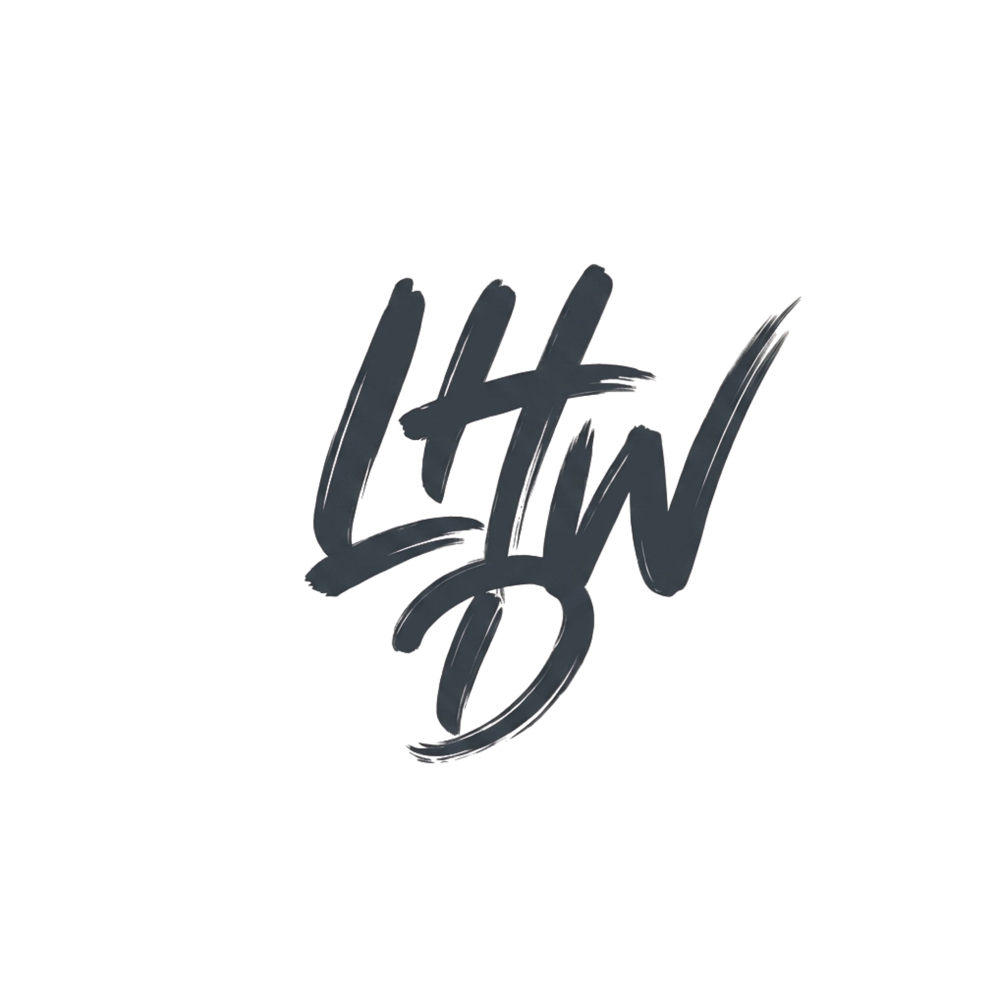
The mark.
Rules
- — Keep clear space around the mark equal to the height of one letter.
- — Don't stretch, skew or rotate.
- — Don't recolour. Ink on cream, or cream on ink. That's it.
- — Minimum size: 64px tall on screen.